An overlooked, constantly repeated understanding McLuhan has is that moral judgement (for better or worse) of an individual using media is very difficult, because of the psychic effects media have on society and their users. Moreover, media and technology, for McLuhan, are not necessarily inherently “good” or “bad” but bring about great change in a society’s way of life. Awareness of the changes are what McLuhan seemed to consider most important, so that, in his estimation, the only sure disaster would be a society not perceiving a technology’s effects on their world, especially the chasms and tensions between generations. <wikipedia>
McLuhan argues that media are languages, with their own structures and systems of grammar, and that they can be studied as such. He believed that media have effects in that they continually shape and re-shape the ways in which individuals, societies, and cultures perceive and understand the world. In his view, the purpose of media studies is to make visible what is invisible: the effects of media technologies themselves, rather than simply the messages they convey. Media studies therefore, ideally, seeks to identify patterns within a medium and in its interactions with other media. Based on his studies in New Criticism, McLuhan argued that technologies are to words as the surrounding culture is to a poem: the former derive their meaning from the context formed by the latter. Like Harold Innis, McLuhan looked to the broader culture and society within which a medium conveys its messages to identify patterns of the medium’s effects. <wikipedia>
In the book ‘Understanding Media’ by MaLuhan, yeats wrote for this reversal, “The visible world is no longer a reality and the unseen world is no longer a dream.”
Remote work culture is defined as the digital culture and working alone at home. We did not expect the world has become a remote work culture. It means we could not separate places to work and life. We are always exposed to computers without realizing it. When the electricity first went out in Ames, I felt I couldn’t do anything. They seem to have become workers who cannot do anything without electricity, computers, and smartphones.
Illustration by Mira Jung
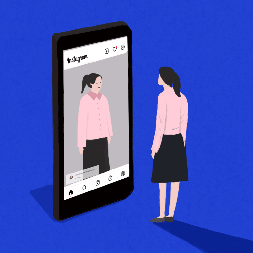
Am I fat?
Social media changes the value of our lives. For example, one of the serious social problems in Korea is the wrong internet culture. There has been a problem with young and beautiful celebrities committing suicide on social media due to malicious comments written by anonymous people. Occasionally, we live with the illusion that we are the real country when crazy about social media. We believe that if people who don’t know us say that we are fat, we tell ourselves that I am fat and live that way.
When people see certain objects and landscapes, they understand them through their own eyes. I was curious about the title ‘how to read a landscape’ because I did not think we could read a landscape, but we could see. The author mentions that reading landscapes can be a valuable methodology for us in this book.
How to read a landscape: “the goal of this particular page is certainly not to provide a comprehensive or systematic guide for those seeking to learn the craft of reading landscapes for the rich natural, cultural, and historical information they contain. Rather, this page is offered as an invitation to begin exploring this endlessly fascinating subject on your own.” You can understand the overall understanding of this article by reading the book. We will have time to contemplate on our own the fascinating subject of how to read a landscape.
I agree with the author’s perspective; you will want to bring a limited set of tools that will allow you to learn and record some landscape components but leave behind anything that will inhibit or encumber your experience.
I like to travel, and I’ve been to 15 countries. I love to learn about new cultures and experiences when traveling to new countries and cities. I saw some travelers are busy recording their trips. Those records sometimes feel like a treasure trove of things, such as a piece of evidence that can be retrieved because we could forget it later. However, we should consider that the camera is sometimes a hindrance if I want to experience and further experience that culture and landscape at that time. Suppose the focus is on taking pictures and not being good at other experiences. In that case, it also seems to take away the joy of travel and projections that inhibit experiencing the landscape. That is okay to take a photo every time you want to see the beautiful scenery with your eyes, but if you want to learn about a landscape, take a journal and pencil. Orienting yourself to the landscape by walking and looking is sometimes more important to learn about landscapes. In addition, visit your landscape throughout the year. If you understand the landscape where you want to learn, you are encouraged to visit each season. Note the species of plants or animals you see at particular times of the year. The changing weather may affect other aspects of the landscape, such as the physical location of structures or the methods of human transportation.
Moreover, it is important to change our perfective and learning landscape by reading documents such as land survey records, old photos, aerial photos, and census records. These documents can tell you how the landscape has been transformed over time. I want to share the questions from the article.
Why did settlers choose this location?
Does it have close access to transportation?
Is it near an urban environment?
What sorts of occupations did the settlers hold?
Is the land conducive for agriculture, or are there resources in the area that can be extracted for profit?
In addition, you could learn about your landscape by considering the relation between monuments and the politics of memory. In this book, particularly historical narratives conveyed by monuments also raise questions about the politics of memory. It is always worth asking about memories that may have been forgotten and how the return of those erased memories can change how we think about modern landscapes. For example, I was born and sent my childhood to the southern part of Korea, named.’
Gwangju. There was historical issues’ Gwangju Democratization Movement. If you know more about the history of ‘Gwangju,’ you could learn more about landscapes. Because of the severe democratization movement, Gwangju has changed its landscape significantly.
Lastly, this article was a very interesting topic, and it was not difficult, so it was a new challenge to read the landscape while reading it comfortably. Even though I lived in Ames, I never thought to understand and write about this neighborhood’s landscape, but I want to try it once by reading this article.
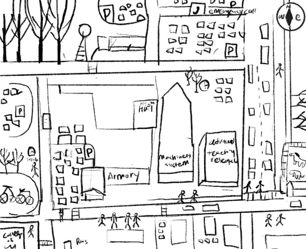
Here is my project to read a landscape of Iowa State University campus. We made four different teams and have a different directions. My team walk through the north part of ISU campus and try to memo what I see. After back to the classroom, I tried to draw the map with my memory.
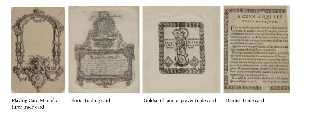
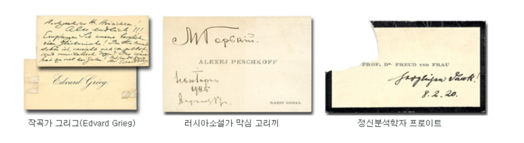
The origins of business cards date back to BC and are said to have originated in China around the 2nd century AD. It is also a kind of communication that judges whether he shows hostility to himself by placing a small stone in front of the person he met for the first time and watching it from a distance.
In Europe, business cards were invented by Louis XIV of France, and copper engraved business cards were used for socializing at 15. In 17th century Europe, wealthy and, to some extent status
17th Century Europe
Business cards began in the 17th century in Europe, where they were used to announce the impending arrival of prosperous or aristocratic people to their local town or even their home. They were shaped and sized in a similar way to a playing card and became a staple of the elite by the middle of the century. In time the cards became engrave with gold and exciting typefaces and by the 19th century the cards were a must have by anyone, who was anyone in the middle class circles of the day. Houses even had card trays, ornate in construction, made so those visiting your house could leave their card in.
19th Century
By the 18th and the 19th centuries these ‘social cards’ were taken from each lady upon her first visit to a house. People were offered the card tray upon the opening of the door to the door and had to place their card in it as a matter of etiquette. This card was then delivered to the lady of the household, who would examine it – in many ways it created the first impression of the person.
19th Century in Korea
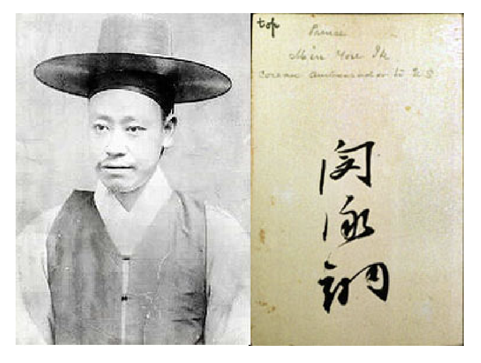
It is believed that the first business card in Korea was Min Young-it’s business card was kept in a museum. It is made of American paper and is 5.5 centimeters wide and 9 centimeters long, similar to today’s business cards, and the name is written in Min Young-ik’s handwriting. Also, it is said that the American person who received the business card wrote ‘Min-young ik, corean ambassador to US’ with a pencil to remember him.
20th Century
Corona 19: Will paper business cards disappear in the non-face-to-face era? BBC NEWS
Matt Stringer, an operations manager in the UK, uses 250 business cards a year.
“I carried 50 business cards with me wherever I went,” he said. “It’s the fastest and easiest way to let people know who I am.” However, the novel coronavirus infection (COVID-19) started to circulate, and since then, Stringer has not used a business card once for a year and a half. “I do everything online.”
Before the pandemic, a huge amount of business cards were produced around the world. It is estimated that there were 27 million pieces per day, or over 7 billion pieces per year. However, many people are starting to worry about bacterial infections. So, even if people go back to work or do face-to-face networking, will the habit of handing over paper business cards disappear?
In the pandemic, we no longer receive paper business cards that can be scanned and added to the system, so Sansan adopted and launched virtual business cards in June of last year. Since then, more than 4300 companies have signed up for this QR code-based system. A code is added when making a video call, and it can also be operated through a smartphone. If the other party wants to see your details, simply scan the screen code displayed on the terminal. Also, what technology will fill that space?
For the project 3 in this class, I decided to analyzing credit card history and design them. Credit cards were made of plastic and started to be used in 1959.
Recently, there has been a tendency to use a debit or credit card more than cash. This is because the card is convenient, can be managed relatively safely, and can be quickly resolved in case of loss. Most new card cards are made of plastic, making them light and convenient. I also usually carry a minimum amount of cash and mostly use a credit card.
However, I have made a lot of cards, and out of the many cards, I use only one card. By using so many cards, I have been thinking about whether we can only continue to use plastic, which is wasted plastic and is one of environmental pollution problems. Many people know that plastic is the main cause of environmental pollution, but plastic cards have become so commonplace that parts are difficult to recognize. Plastics affect the environment from the manufacturing process. In general, if you make one plastic card, harmful substances such as three cages are generated, and after that, more than 8 million tons of plastic are thrown into the sea every year. Among them, 260,000 teas are becoming well-known garbage islands or floating around in the sea, causing environmental pollution.
Various companies are introducing various measures to prevent environmental pollution caused by plastic cards. The most popular method is to issue mobile cards. However, there are still many cases where a mobile card is issued after a physical plastic card. To compensate for this, a Korean company started a plastic card zero campaign starting this year, in which mobile cards are issued without a plastic card.
And as another method, there are cases where the physical card is made of an eco-friendly material other than plastic. BC Card, a Korean company, is made of green card eco-friendly wood material, has low carbon emission and harmfulness has added eco-friendly benefits, and can also be converted to a mobile card. Shinhan Card’s Deep Eco Card plate is made of wood that has been certified as eco-friendly so that even if it is disposed of, it has little impact on the environment. Starbucks Korea even launched a card made of recyclable paper instead of plastic. In addition, food product packaging materials were used as biodegradable plastics that biodegrade and bioplastics that emit relatively little carbon dioxide.
The history of credit cards as we know them today began in 1950, when Diners Club launched the first modern credit card. Credit card history also includes a number of important milestones from 1950 to today, including the introduction of magnetic stripe verification in the 1960s and EMV chip technology in 2010.
Unlike early credit cards, which were all “charge cards” that had to be paid in full at the end of the month, most modern credit cards allow people to carry a balance between months. That means the type of credit card in your wallet today has likely been around only for a tiny fraction of all credit card history. Below, you can see an in-depth timeline of the history of credit cards, followed by a discussion of how credit cards developed to their current state. <https://wallethub.com/edu/cc/credit-card-history/25894>
Early History of Credit Cards
The concept of buying things on credit has been around since ancient times, and it became more refined in the 19th century, when companies began to use metal coins with their logo and customers’ account numbers emblazoned on them to keep track of transactions made on credit. Then, in the early 20th century, a handful of U.S. department stores and oil companies began issuing their own credit cards – the forbearers to modern store cards – that were only usable at the particular business that issued them.
Those products paved the way for the first true credit cards – the Diners Club charge card in 1950 and the BankAmericard charge card in 1958. Unlike all previous credit products, these cards could be used at multiple merchants. They still were limited compared to credit cards today, though. They were only usable for travel and entertainment purchases, and cardholders had to pay the bill in full each month.
The History of Credit-Card Modernization
Invention of plastic credit cards: American Express was the first issuer to offer a plastic card, beginning in 1959.
Introduction of revolving balances and general-purpose use: BankAmericard introduced the concept of carrying a balance from month to month in 1958. Then, in 1966, they upped the ante even further by offering the BankAmericard nationally as the first general-purpose credit card.
Development of competing credit card networks: Along with Diners Club in 1951 and BankAmericard in 1958, American Express offered its first credit card in 1958. Mastercard was founded several years later, in 1966, and BankAmericard turned into Visa in 1976 after splitting off from Bank of America. Discover joined the game relatively late in 1985.
Magnetic stripe technology: In the 1960s, IBM developed magnetic stripe technology, which could be used for electronic card verification at merchants. American Express used this technology on certain airline cards as early as 1970, but it wasn’t until 1980 that this technology began rolling out on credit cards from the other major networks.
Credit card rewards: The Discover Card introduced the concept of giving cash back on purchases in 1986, and the practice became more common from the 1990s onward. Other types of credit card rewards have also developed, as many cards offer points or miles.
EMV technology: The EMV chip in your credit card helps keep transactions more secure, as it’s more encrypted than a magnetic stripe and it creates unique transaction codes that can’t be used again. This technology was first used in the U.S. in 2010, but picked up quickly from 2015 onward when merchants were mandated to accept the technology or face liability for fraudulent transactions. Around 1.6% of all U.S. payment volume was on EMV cards in 2015, compared to 99% today.
Contactless payments: Since 2008, some credit cards have offered the ability to make contactless payments, without the need to insert a card into a reader. As of 2020, around 67% of merchants accept contactless payments.
Virtual credit card numbers: A technology introduced in 2009 lets you shop online using your credit card without actually exposing the card’s sensitive information. These virtual credit card numbers are a way to stay safe from identity theft and fraud in an age where there is a growing number of data breaches.
Use of credit explodes: Only 51% of households had a credit card in 1970, but that number has grown to 83% in 2021, which is a testament to how much Americans have embraced credit cards over time. We’ve seen monstrous growth even since the turn of the century, too. In 1999, there were around 365 million credit card accounts open. In 2020, there were over 511 million accounts. That’s around a 40% increase!
Our credit card debt has skyrocketed, too. In 2017, U.S. consumers hit $1 trillion in credit card debt for the first time, and despite some payoffs, we’ve stayed close to that number ever since. We currently owe more than $920 billion to credit card companies, or a bit over $7,800 per household.
The nature of credit cards clearly has evolved a great deal over time – and so has our use of credit.
Keywords: Immersive art, Interactive art, alternative art
Most Interesting Immersive Art Experiences Around the World.
Just a few years ago, we visited the museum to see the original artwork. As such, we visited the art A few years ago, we visited the museum to see the original work. So, we went to the art museum to experience the vividness of the original work, expecting something different from the images we saw on the internet. Perhaps John Berger, author of Ways of Seeing, also explained the power of the original work by explaining that what you see in real life is different from what you see in a copied image. Today, however, visitors pay expensive tickets to see the copied images, even though art galleries do not have original works. We call it interactive art. The experience of 3D artwork created by the fusion of art and new experiences has expanded since the Corona era.
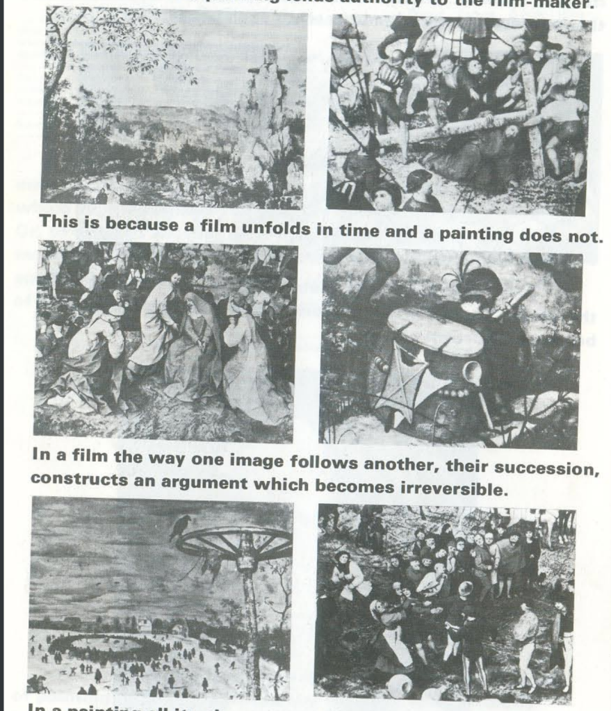
Seeing John Berger’s comments on reproductions in which the work’s authenticity is distorted, I wondered if he could have imagined that we today take a replica product and fuse it with experience to approach the viewer from a different perspective. In the book “way of seeing p.24”, In the age of pictorial reproduction, the meaning of paintings is no longer attached to them; their meaning becomes transmittable: that is to say, it becomes information of a sort, and like all information, it is either put to use or ignored; information carries no special authority within itself. When a painting is put to use, its meaning is either modified or totally changed. One should be quite clear about what this involves. It is not a question of reproduction failing to reproduce certain aspects of an image faithfully; it is a question of reproduction making it possible, even inevitable, that an image will be used for many different purposes and that the reproduced image, unlike an original work, can lend itself to them all. Let us examine some of the ways in which the reproduced image lends itself to such usage. Reproduction isolates a detail of a painting from the whole. The detail is transformed. An allegorical figure becomes a portrait of a girl.
when a painting is reproduced by a film camera it inevitably becomes material for the filmmaker’s argument. A film that reproduces images of a painting leads the spectator, through the painting, to the filmmaker’s own conclusions. The painting lends authority to the filmmaker.
There is a museum for just about everything if you look hard enough, but these attractions take the traditional experience of passively viewing art and flip it on its head. They encourage visitors to interact with the exhibits—at a safe distance from others and with a variety of new safety measures in place such as disinfectants, one-way traffic plans, reduced visitor capacity and more—and experience art in a new way. As museums begin to open their doors after months of going dark, some of the most interesting immersive art experiences around the world.
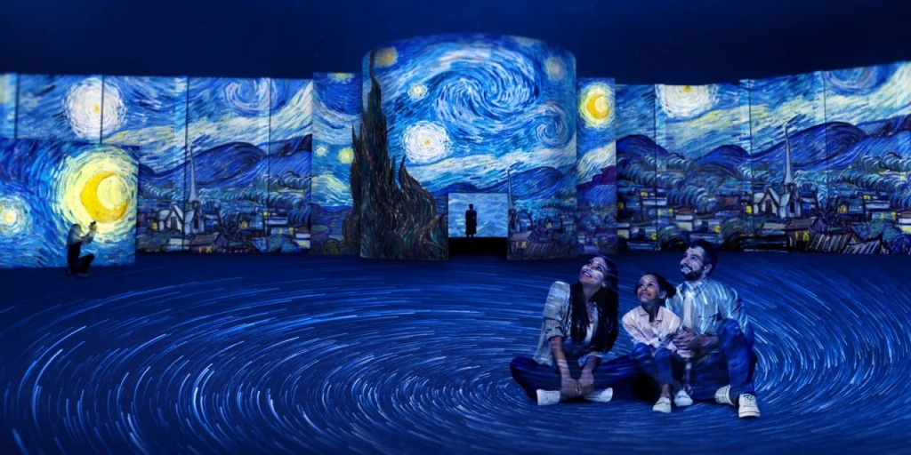
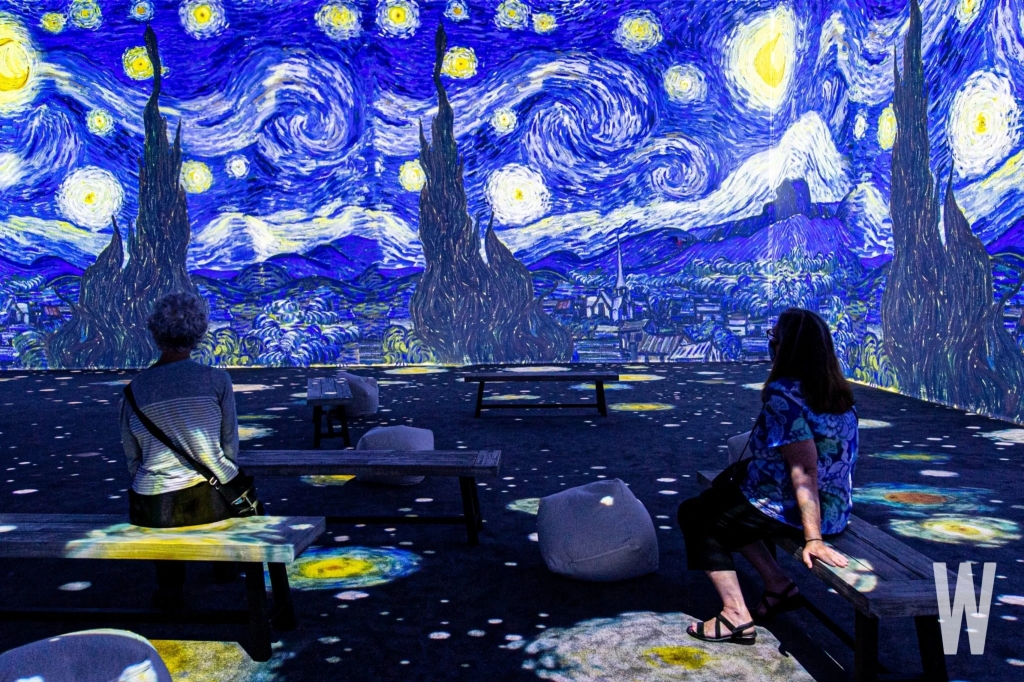
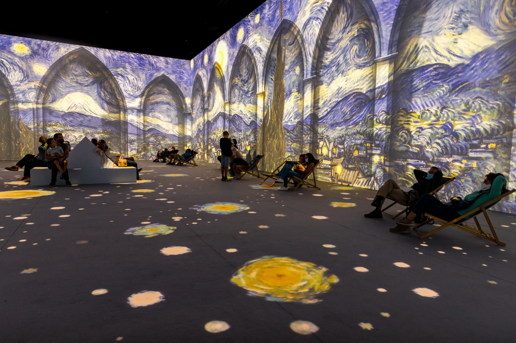
Then, how about an immersive art museum that invites visitors into the painting? Does this distort the original artwork from the 3D creator’s point of view, just as it distorts the view of the painting through the eyes of a filmmaker? Or are you trying to calculate this distorted point of view and deliver it to the listener? This seems to be a question we will think about through the “Beyond Van Gogh” exhibition.
You will NOT see in “Beyond Van Gogh” are these kinds of original works. If you’re looking to connect with the artist by getting your eyes close to his brushstrokes on canvases he touched with his very hands; you won’t get that here. Instead, the experience is a multimedia one that uses projection technology to insert you into those works in a way that almost no other experience can (except perhaps a visit to Arles). “Beyond Van Gogh” was created by Director Mathieu St-Arnaud at Montreal’s Normal Studio.
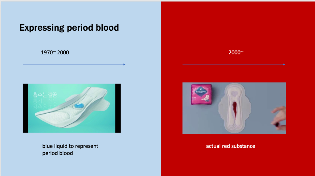
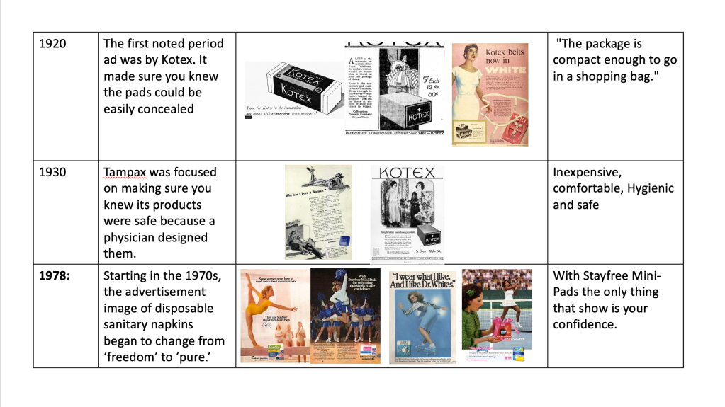
The disposable sanitary napkin was a high-tech invention (inspired, incidentally, by military products) that changed the way women dealt with menstruation. It also helped create modern perceptions of how menstruation should manage through its advertising, which was remarkably explicit and strictly adhered to emerging stereotypes about the “modern” woman of the 1920s should aspire to. Before Kotex’s arrival on the scene, women didn’t have access to disposable sanitary napkins—the “sanitary” part was a huge step forward for women who could afford these products. But the brand’s creator, Kimberly-Clark, also reinforced through its advertising campaigns that menstruation was something to conceal and a problem for women rather than a natural bodily function. In the flow of domestic sanitary napkin advertisements in Korea, attempts to hide menstruation occurred frequently. These attempts were made using alternative words such as ‘the day’ to replace the word menstruation and promote a clean image instead of direct exposure of menstrual blood.
The first disposable sanitary napkins produced in Korea are sanitary napkins of the brand ‘Cotex’ produced by Yuan-Kimberly, a company specializing in household goods in 1971. Then, in 1975, Cortex launched the self-adhesive disposable sanitary napkin and became very popular. At the time, newspaper advertisements emphasized a modern and urban image, such as a woman riding a short-sleeved bicycle with the phrase “Who liberates women?” Ewha Woman’s University Asian Women’s Studies Center Researcher Noh Ji-Eun, in her thesis 『Discourse on Sanitary Napkin Advertising Discourse and Women in the 1970s and 1990s』, “Yuan-Kimberly started advertising with a focus on ‘women’s liberation to offer a new product to female consumers in a conservative social atmosphere at the time. did,” he explained.
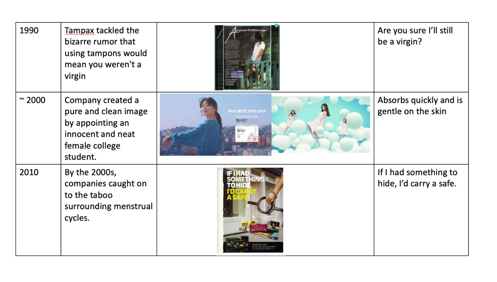
As recently as the 1980s, scientific diagrams showing how to insert tampons were blue. A Sure & Natural ad from 1983 compared the inefficient absorbency of a conventional pad with the quick dispersion of liquid in a “Maxishield” using royal blue liquids. Further graphics demonstrating layers of absorbency in pads used blue arrows and blue ink to demonstrate their effectiveness. White is also commonly featured in pad ads — a color symbolizing purity and an idealized feminine state for women. In 1973, a brand called Dr. White’s appeared. Its ads featured young women dressed in white bikinis, pantsuits, white lingerie, or white dresses.
Scholar Ira Torresi described the “moral duty of cleanliness” historically required of women. This is an obligation reflected in the continued use of white in these advertisements. Menstrual periods were often considered dirty, so descriptions of pads and tampons were considered “hygienic.”
Even during the 1970 and 1980s, sexist and over-sexualized images of young women were used to sell period products. One Tampax ad featured a prepubescent girl in a barely-there bikini top more appropriate for an adult. Studies have shown that such sanctification and objectification lead society to view women as “disabled and less intelligent.” Rather than empowering women, this image and other images I found set unrealistic expectations of how menstruating girls should look and feel.
Before sanitary napkin TV commercials began in earnest in the mid-1990s, sanitary napkin advertisements were mainly delivered through print media, and advertisements for women’s magazines targeting female consumers who use sanitary napkins were an important discourse production space for popularizing sanitary napkin products. It recaptured the No. 1 position in the sanitary napkin market with the launch of ‘Cortex White’ in 1995 with the slogan of “Clean” and the series ‘Cotex Good Feeling’ in 1999 in Korea. White created a pure and clean image by appointing an innocent and neat female college student. White’s ‘pure and clean image’ is stronger than the public college students. I wanted to appeal to the social issues related to health, environment, safety, and women’s issues at the time. It has nothing to do with the rise of power.
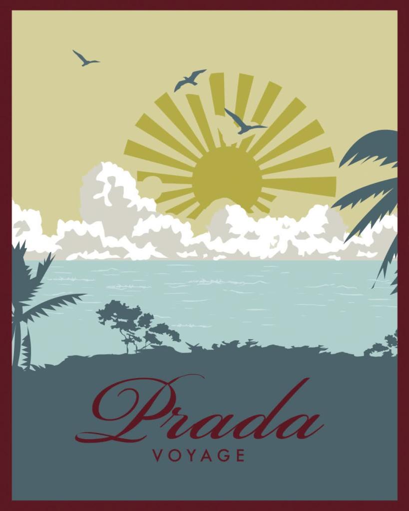
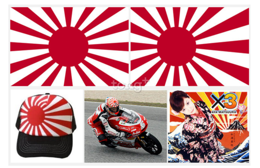
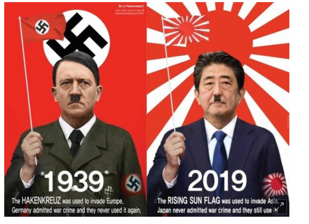
This poster was posted on the official Instagram account of Prada. This promotional material was a promotional design with the theme of travel. This seemingly ordinary video was made with the theme of travel, but what became a problem was the shape of the sun in the video. The sun was drawn in a radial pattern extending outward from the center. This symbolizes Japan’s Rising of the Sun. Korean netizens point out that it is not red like the rising sun flag, but the shape is reminiscent of the rising sun flag.
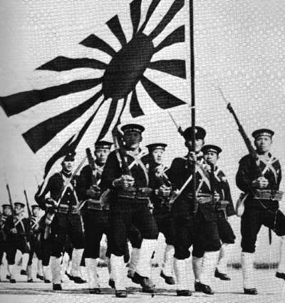
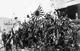
So, what is the Rising Sun Flag? Many foreigners do not know about the Rising Sun Flag and purchase products just by looking at the pattern. The Rising Sun Flag (旭日旗, Kyokujitsu-ki) is a Japanese flag that consists of a red disc and sixteen red rays emanating from the disc. Like the Japanese national flag, the Rising Sun Flag symbolizes the sun. The flag was originally used by feudal warlords in Japan during the Edo period (1603–1868 CE).
The Rising Sun Flag was the flag used by Japan during World War II. With Nazi Germany’s Hakenkreuz, it is a symbol of aggressive aggression. Prada previously released clothes reminiscent of the Rising Sun Flag in 2014. Korean netizens strongly raised the issue, but Prada did not show a much different reaction.
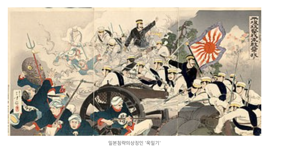
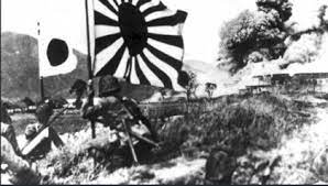
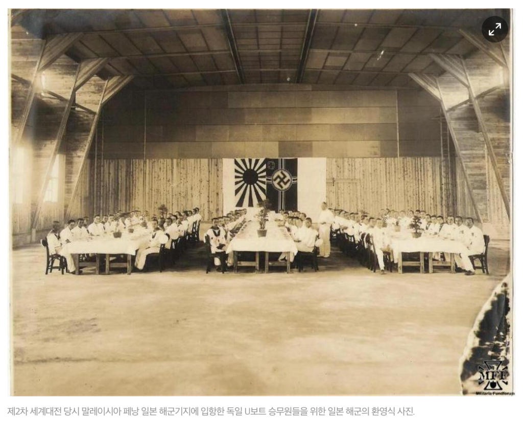
The Rising Sun Flag is a flag with a clan inscription embodying the sunlight spreading around the sun. The clan is a traditional pattern that has been used in Japan for a long time to pray for the crest of a samurai family or a good harvest for fishing boats. Because it is a symbol of The name of the Rising Sun Flag also contains the idea of Japanese imperialism, which ‘builds an empire with the momentum of the rising of the morning sun.’During World War II, the Japanese Navy held a welcome ceremony for the crew of German U-boats who entered the Japanese Naval Base in Penang, Malaysia. Both are symbols of the navy. Source: News Top (http://www.newstof.com)
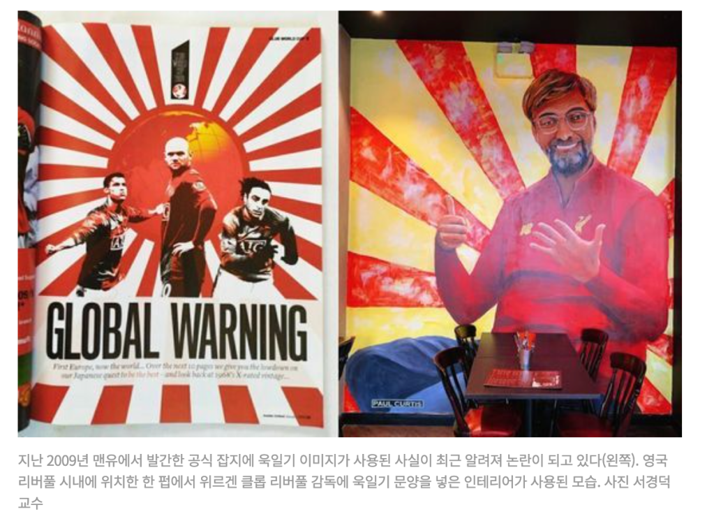
The Rising Sun Flag is a ‘war criminal flag’ made and used by war criminals like the Hakenkreuz, a hooked cross symbolizing Nazi Germany. However, in contrast to Germany’s thorough ban on using Hakenkreuz by repenting of its past wars, Japan has been using the Rising Sun Flag without reflecting on its history of war and aggression. The Rising Sun flag is the flag of the Japanese Self-Defense Forces and is widely used for cheering flags for sports events and marketing popular culture products.
It is also a problem that Japan, which caused war and caused great damage to the world’s people, continues to use the Rising Sun flag without historical remorse, but the bigger problem is that even Korea, the biggest victim, does not know why this is a problem. Considering that people have lived through the harsh times due to the Japanese occupation and still live with the pain without proper compensation or apology, it would be impossible to dare to use or defend the Rising Sun Flag, a criminal war flag. The use of the Rising Sun Flag is ignorance of history, and this cannot be excused.
In the book “The politics of Design,” research shows that ninety-eight languages have words for the same eleven basic colors; however, the meaning a color may have can be very different. There are conflicting theories on whether the cultural meanings of colors can be categorized. Meaning can change over time and depend on the contest. For example, Koreans are called the ‘white coat people.’ Because people liked to wear white clothes in the past, Korean people have worn white clothes for thousands of years, forming a unique and unique national sentiment. Many scholars have tried to explain this reason. I was taught in school that Korea did not have the skills to make colors at that time, but this is also not the exact reason.
Folklorist Nam-seon Choi argued that the white light, which symbolizes the sun, was considered sacred and that the Korean people wore white clothes with pride. It is theorized that the primitive belief in the worship of the sun made people like white light. However, it is said that the white belief is a general tendency of northern Asian peoples. Mongolia, the origin of the northern peoples, is a country that ‘starts with white and ends with white.’ They are the original ‘white coat people.’ This is also the case when you see a ‘god of agriculture’ with a cow’s head and wearing a white robe on the murals of tombs in Goguryeo.
However, beliefs and ideas about white may be the origin of white clothes, but they cannot fully explain why they have been preserved for thousands of years. There must be some practical reason. Recently, a cultural historian found the reason in ‘lye.’ ‘Lye water is a natural alkaline solution made by immersing the ashes of burnt rice straw or bean hulls in the water. In the early days, the Korean people maintained their white clothes were always white by using the washing method of sterilizing and bleaching by boiling the laundry in lye water.
The lye water makes stiff cotton clothes white and supple. Even clothes soaked in the dirt while working in the paddy fields can be reborn as dazzlingly white clothes by boiling them once in lye water. As long as there was lye, the white-robe people’s entrance could always shine white.
It is difficult to say one single reason why we are a white-robed people. But at least that’s not because of Han (恨, kinds of emotion). Not just because I believed in white. Contrary to the common notion, white clothes for the Korean people were easy to clean and hygienic. Because of the convenience of such a reality, our ancestors did not have to be “colored” people.
However, in the Joseon Dynasty, high-ranking officials who lived and died under the law insisted that white clothes should be banned by law. In the year following his accession to the throne, Taejong issued a ban on white clothes, and during King Sukjong’s reign, high position officer Heo Jerk and Min Chang-do also argued that white clothes should be banned. During King Heonjong and King Yeongjo, the state issued a white coat ban. Because of the ‘five-element theory,’ the country had been betting on white clothes all along. Since Joseon, the eastern country, is ‘wood’ among the five elements, it was the nobles who worshiped Confucianism that they should wear blue clothes that symbolize it. Besides, white clothes are mourning clothes (喪服), so it was considered taboo.
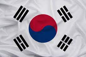
The white love of Koreans is also reflected in the Taegeukgi. First, the white background of the Taegeukgi symbolizes the purity and brilliance of the white-robed people and, at the same time, expresses the peace-loving ethnicity of the Korean people.
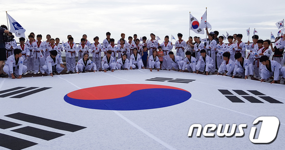
제74주년 광복절인 15일 오전 경북 울릉군 사도항에서 광복절을 경축하는 태권도 퍼포먼스가 열렸다. 태극기 퍼포먼스는 경북도와 울릉군, 국기원이 일본 아베정권의 경제보복과 독도 영유권 주장에 맞서 독도가 우리 땅임을 확인시키기 위해 마련됐다.(울릉군제공) 2019.8.15/뉴스1
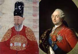
Also, since the red dye was expensive in the old days, it was mainly the color of clothes worn by nobles or royalty. In the East, it was the second most noble color after yellow, and in the West, it was also considered the second most noble color after purple. In the East, yellow, which symbolizes the center of
From time immemorial, kings have used color to symbolize powerful royal authority. This is because colors can contain various emotions and meanings beyond words. Red was the color most loved by kings in the East and the West. Red symbolizes powerful vitality such as the sun, fire, blood, auspiciousness, and joy. In portraits displayed in museums, it is easy to see the kings who boasted powerful royal powers, such as Louis XVI and Napoleon, dressed in red.
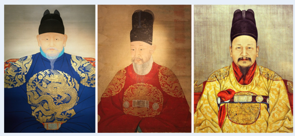
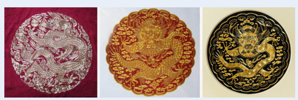
The symbol color of the kings of the Joseon Dynasty is also red. If you look at the royal coat of arms of the kings of Joseon, all the kings except for the founding monarch, Lee Seong-Hye (blue) and King Gojong (golden), who founded the Korean Empire, are wearing red goryongpo. The fact that the color of the Joseon king is red is partly because it is a symbol of strength and vitality, but also because he had to avoid “yellow,” the color of the Chinese emperor. According to the yin-yang and five elements theory, a traditional Eastern thought, blue means east, white means west, red means south, black means north, and yellow means center. Did. Chosun, which was immersed in the four major Chinese ideologies, had no choice but to choose the king’s color from among the colors other than yellow, the color of the Chinese emperor, and among the kings of Joseon, Gojong was the only one to wear gold.
Also, every decoration on the king’s clothes had a meaning. In particular, depending on the dragon’s claws embroidered on the clothes, the status of the person changes. The king has 5 dragon claws, while his son the Crown Prince has 4 claws.
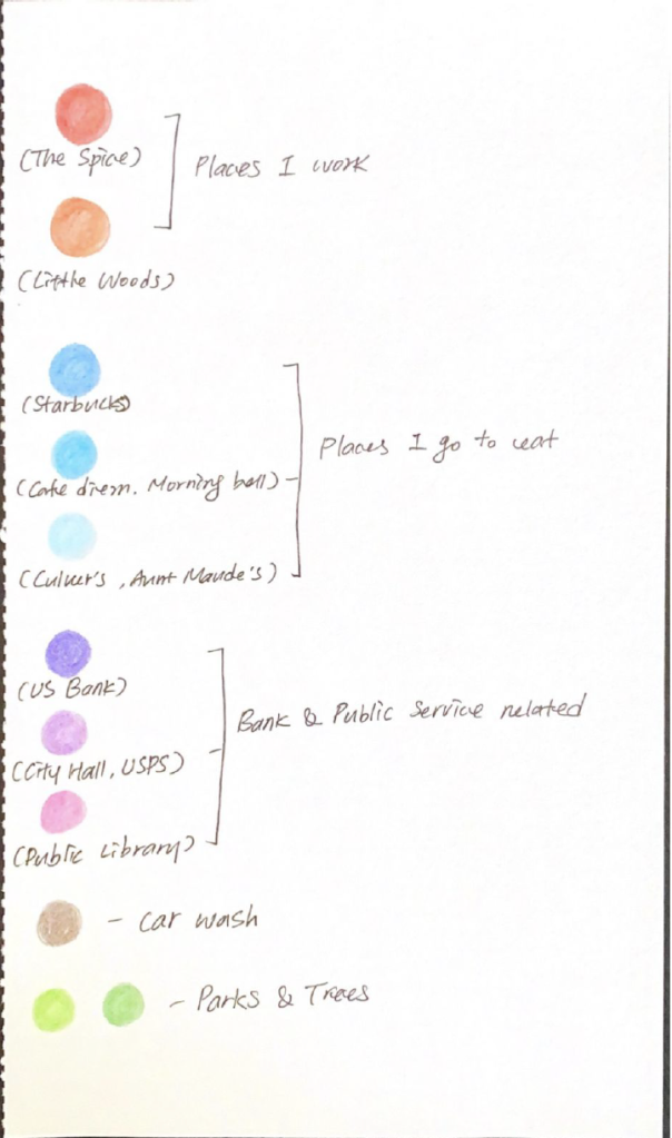
We had a chance to take a map at random for analysis in this class. We each had the opportunity to analyze the maps we had chosen and had to make our own map. This portion of the project aims to evoke and represent a “sense of place” in the form of a mapped experience. But I just wanted to analyze the landmark map with decode and encode.
Overall Analysis of Map
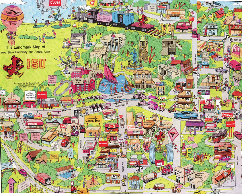
This landmark map of Iowa State University and Ames was sponsored by the Government of the Student Body at Iowa State University. It was made in 1985, and Media Maps produced maps in Tulsa. The map’s front side has illustrations, and the biggest area on the back is a 2D roadmap with the locations of the stores the lists information from many stores. The map is about 34 x 40 inches, and there is no folding line; it is difficult to carry while we look for someplace with the map.
The landmark of Map (The backside)
The roadmap occupies the largest area on the backside. The roadmap is a combination of alphanumeric characters so that the area can be found in red boxes. Next to the roadmap is the landmark’s location information and phone number to find the stores in the index. However, the text written on the roadmap is so small that it is difficult to read, and it is practically impossible to find the exact location. Also, you can see that the landmark is within the red area, but you cannot find the exact location within that area.
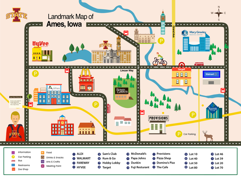
Encoding _ Landmark Map of Iowa State University
The map that I encoded with the landmark map of Ames but a different concept by applying the theme of the selected map as it is. I tried to design the location with the logos easily because logos are part of the symbol that easily recognizes the place on the map. Other complex elements have been removed so that you can quickly find landmarks using the logo.
First, I considered the target audience when making the landmark map. The target audience was Iowa students, visitors, and villagers. And I thought about what information they needed. One of the most important information for students is probably transformation, and then I thought about whether it would be a grocery store. On the map, only the logo was used to designate the location of the landmark buildings, and I tried to make it as simple as possible. The legend of the map has only the name of the place. However, it does not seem to be a good case for a building where the logo is unfamiliar. The names of the school’s buildings were difficult to label as each did not have a unique name. Also, logos of educational institutions using the same design may confuse users when looking for buildings.
The illustrated map can be a good example of representing landmarks. In cities where the government industry is the main source of income, there are many cases where landmark designs are produced as illustrations and sold as tourism products to tourists. In addition, landmark buildings with world cultural history have symbolism that many people can recognize just by their building shape, so it is easy to find the area even if you use a simple picture or symbol without using a real photo. Ames’s most recognizable and iconic buildings were mainly placed when making this map.
Reflection of classmate’ presentation
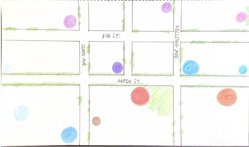
The Main Street Map
This is one of my classmate’s maps. She draws the map with her own experiences. For example, the red color circle represents a building where she spends most of her time in that building because it is her workplace. Behind the big red circle, brown with a small circle represented the building with a bad memory. She used the brown color to reflect her emotional sense in this map.
This is the legend with the map and she explains the map with it.
The interesting part of this map is unconscious, but the colors she used for her favorite building were warm, but she used a bad experience with dark colors.
In modern society, publicity images and other visual messages have in common than in the past. There are many advertisements images around us, and we can see many wall image signboards, many posters, etc. People now realize that publicity images as part of the environment and our life.
There are many advertisements examples for explaining publicity celebrates the future buyer and the glamorous life in the book. Page 132 includes an alcohol advertisement showing groups of people enjoying drinks in their favorite places. Berger says that publicity is effective precisely because it feeds upon the real. In the video, he compared envied people to powerful administrators. He also mentioned that publicity is manufacturing glamour than looks, but it depends upon them. Glamour works through the eye and the mirror. Personal envy is a less familiar emotion, and without social envy, glamour cannot exist. Envy becomes a common emotion in a society that has moved towards democracy and then stopped halfway, where status is theoretically open to everyone but enjoyed by only a few. I was interested in his idea in the video because of the development of social media; it is easy to compare around people and can envy them. But Berger also mentions that publicity also works on our anxieties about money.
Moreover, he believes the language of publicity connects to the language of oil painting. On page 135, he said publicity images often use sculptures or paintings to lend allure or authority to their message. Art is a sign of both wealth and European cultural authority. What makes art so useful to an advertisement, Berger argues, is art’s ability to portray the contradictory values of “wealth and spirituality” simultaneously. In the video, Berger mentions that sometimes works of art give prestige to a publicity scene. In the past, oil painting tried to show a medium especially developed to render the physical texture and tangibility of things on canvas. Today color photography performs a similar though color photography oil pint. Publicity and oil painting use many references and celebrate the same qualities in things that share many ideals. However, the mediums differ because the spectator-owner of oil paintings and the spectator-buyer of advertisements are different audiences. Oil paintings are designed to show a standard of living their wealthy owners already enjoy. Advertisements are designed to show potential buyers what their lives lack and offer them a better life.
Look to the 152 pages, Berger’s contrast between advertisements that white women in a suburban home and serious happen to Pakistan can be shocking. The contrast can be shocked morally through the advertisements. Berger says, is the fact publicity exists in an eventless future. Real events don’t happen in the world of publicity.
On the last page, Berger ends with the paragraph, “Publicity is the life this culture – in so far as without publicity capitalism could not survive – and at the same time publicity is its dream. And he also said, “to be continued by reader …” indicates that Ways of Seeing is meant to be a starting point.